
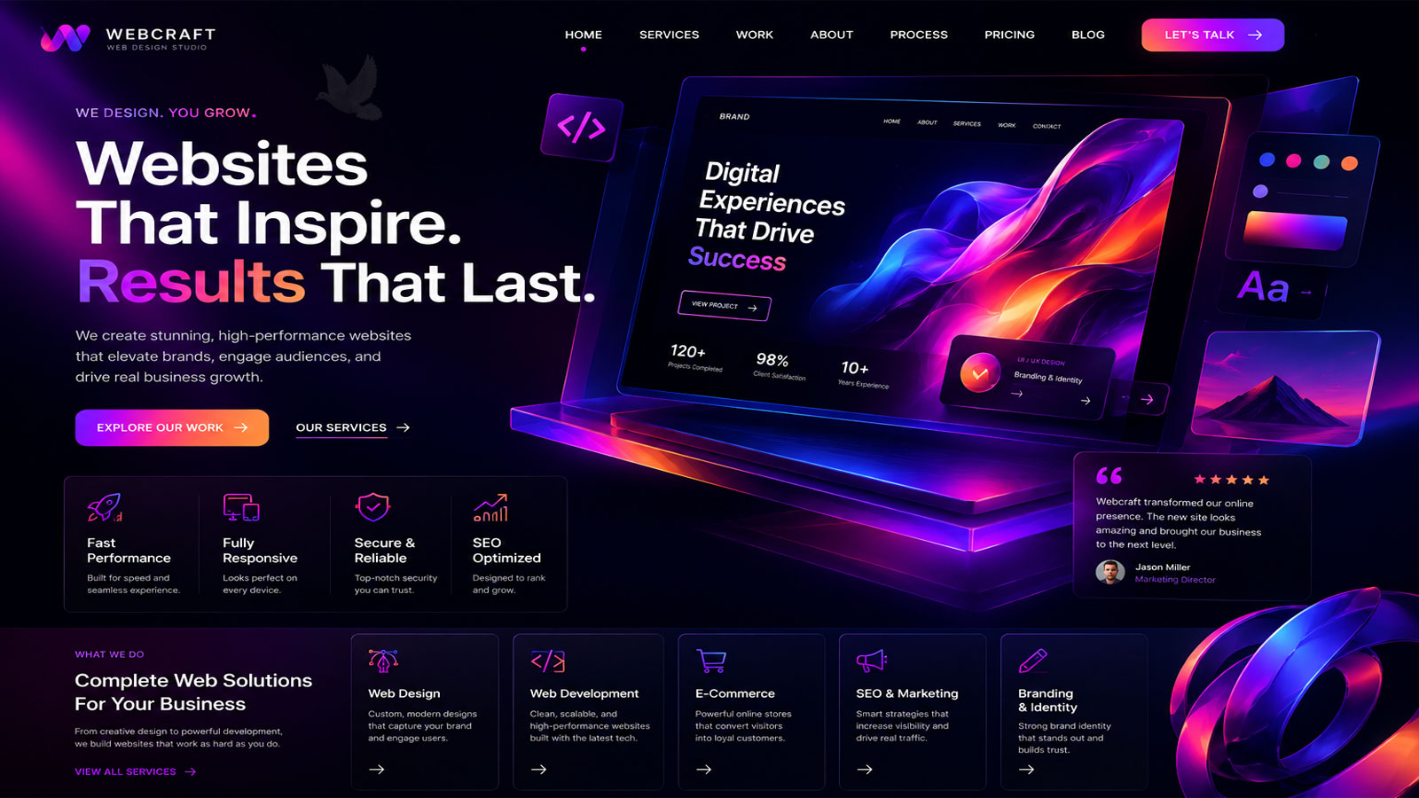
Website Design for Structure, Usability, and Responsive Layouts
A website has to do more than look finished. Its structure determines how visitors find information, its layout controls how that information is presented, and its design influences whether the site remains clear and usable across desktops, tablets, and phones. Website design brings those pieces together into an interface people can understand and navigate without having to figure out how the website works.
The process begins with the purpose of the site and the information it needs to communicate. Pages, navigation, visual hierarchy, content placement, responsive behavior, and interactive elements can then be organized around that purpose rather than added independently and forced to work together afterward.
A Good Website Begins With Structure
Navigation should make the important parts of the website easy to reach without forcing visitors to search for them. Main pages, supporting pages, service categories, and contact paths need to be grouped in a way that reflects how people actually look for information.
Not every page has the same job. Some pages introduce a subject, others explain a service, and others lead visitors deeper into a specific topic. A clear hierarchy helps each page support the larger site without competing with or duplicating the purpose of another page.
Headings, paragraphs, images, calls to action, forms, and supporting elements need to appear in an order that makes sense as the visitor moves through the page. Good placement helps important information stand out while preventing the layout from becoming crowded or difficult to follow.
A layout that works on a large monitor must still remain usable when the available space becomes much smaller. Columns, images, text, menus, buttons, and interactive elements need to adapt cleanly across desktop, tablet, and phone rather than simply shrinking into a tighter space.
Website Structure
Visual Identity
Colors, typography, imagery, spacing, shapes, and other visual details establish the character of a website. When these elements follow a consistent direction, individual pages feel like parts of the same site rather than unrelated designs assembled over time.
Design Should Guide the Eye
Visual design helps establish what visitors notice first, what they recognize as related, and where their attention moves next. Size, contrast, spacing, typography, imagery, and positioning create visual hierarchy, allowing important information to stand apart without making every element compete for attention.
Consistency is equally important. Repeating established styles for headings, buttons, images, forms, spacing, and other interface elements makes the website easier to understand as visitors move from one page to another. The design can still vary where the content requires it without losing the visual language that connects the site as a whole.
Visual Hierarchy
A page should not demand equal attention for everything it contains. Strong hierarchy separates primary information from supporting details and helps visitors recognize headings, content groups, actions, and transitions as they move through the page.
Responsive Design Is More Than Making Things Smaller
Desktop, tablet, and phone screens provide very different amounts of space, but responsive design is not simply a matter of shrinking the desktop version until it fits. The layout has to reconsider how information is arranged, how columns stack, how navigation behaves, and how interactive elements can still be used comfortably when the available width changes.
Some elements may need different spacing, proportions, positioning, or presentation depending on the device. The objective is to preserve the purpose and clarity of the page while allowing its structure to adapt naturally to the screen being used.
These adjustments should feel natural to the visitor, allowing the same information to remain accessible without making the smaller version of the website feel compressed or incomplete.
The screen changes. The purpose of the page should not.What Has to Adapt
Responsive decisions should be tested rather than assumed. A layout can appear correct at one width and still create awkward wrapping, oversized images, cramped controls, or misplaced content at another.
A Website Has to Be Easy to Use
Visitors should not have to study a website before they can use it. Links should behave as expected, buttons should be recognizable, forms should be understandable, and important actions should be easy to locate without competing against unnecessary distractions.
Good usability often goes unnoticed because the interaction feels natural. Problems become obvious when visitors hesitate, click the wrong element, lose their place, or cannot determine what they are supposed to do next.
Usability also depends on consistency from one part of the website to another. When navigation, controls, visual cues, and common actions follow familiar patterns, visitors can use what they have already learned instead of having to interpret each page differently.
Small obstacles can become significant when they appear repeatedly throughout a site. Removing unnecessary steps, clarifying choices, and simplifying interactions helps visitors concentrate on the information or task that brought them to the website in the first place.
Clear Interaction
Make actions recognizable.Clear Interaction
Buttons, links, menus, forms, and other controls should visually communicate that they can be used and respond in a predictable way when visitors interact with them.
Readable Content
Make information comfortable to follow.Readable Content
Typography, line length, spacing, contrast, headings, and paragraph structure influence how easily visitors can scan a page and understand the information being presented.
Clear Direction
Make the next step understandable.Clear Direction
Visitors should be able to recognize where they are, what options are available, and how to continue toward another page, a service, a form, or another relevant action.
The Design Should Support the Content
A page should not be designed first and then filled with whatever information happens to fit the available spaces. The amount and type of content influence how the page needs to be organized, how much visual separation it requires, and which elements deserve greater emphasis.
A service page, contact page, portfolio, informational article, and homepage do not communicate in the same way. Their layouts can share the same visual identity while still being structured differently according to what each page needs to accomplish.
Content Gives the Layout Its Shape
Headings establish subjects and transitions. Paragraphs provide explanation. Images can demonstrate, support, or reinforce information. Lists make groups of related details easier to scan, while forms, buttons, and other interactive elements allow the visitor to take action. Each type of content has a different role within the page.
The challenge is deciding how those pieces should relate to one another. Too little structure can make useful information difficult to follow, while excessive design can compete with the content it was supposed to support.
When the layout follows the information instead of forcing every page into the same arrangement, individual pages can develop their own character while still remaining recognizable as parts of the same website.
A Website Should Be Designed Around What It Needs to Do
Website design brings structure, visual communication, responsive behavior, usability, and content together into one working experience. Each decision affects the others, which is why a successful site cannot be reduced to choosing colors, arranging a few sections, or selecting a template that happens to look appealing.
The right approach depends on the purpose of the website, the information it contains, the people who will use it, and the actions those visitors need to perform. Whether the project involves creating a new website or rethinking an existing one, the design should be developed around those requirements rather than forcing them into a predetermined layout.